Express buttons
Pay.Parts rendering the express checkout buttons.
Express Buttons
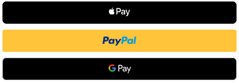
The Express Buttons component renders a group of express checkout buttons (Apple Pay, PayPal, Google Pay) in a single container for ease of use. Buttons render as skeleton placeholders immediately, then load their payment scripts and are replaced by the real buttons. Buttons that are not available in the customer's environment (e.g. Apple Pay on a non-Apple device) are automatically hidden.
Usage
Mount the component using the checkout-buttons method name:
const checkout = await window.PayPartsSDK.init({
  expressButtons: ['applepay', 'paypal'],
});

const expressButtons = checkout.prepare('checkout-buttons');
await expressButtons.bind('#express-buttons-container');
Available buttons
| Button | Name | Method ID | Default order |
|---|---|---|---|
| Apple Pay | applepay | 2277 | 1 |
| PayPal | paypal | 138 | 2 |
| Google Pay | googlepay | 2558 | 3 |
Buttons only appear when they are available in the customer's browser/device. For example, Apple Pay is only shown on Apple devices with Apple Pay support.
Configuration
All options are passed to PayPartsSDK.init().
Rendering the methods

In your Sales location you need to enable the methods prior to getting them back through a session token. Session tokens and their Sales Location have a potential cache of 15 minutes.
Apple Pay boarding
For Apple Pay you need to also add the .well-known file of PAY to your domain:
https://parts.pay.nl/.well-known/apple-developer-merchantid-domain-association.
It needs to live at that exact path [YOUR_DOMAIN]/.well-known/apple-developer-merchantid-domain-association.
After that, your domain must be whitelisted in our platform during the onboarding process. Simply send an email to [email protected] containing the URL of your .well-known file, and we'll take care of the rest and the associated serviceId.
PayPal boarding
For PayPal you need to follow the boarding instructions and provide your Secret and ClientID through our boarding process.
expressButtons
Controls which buttons are rendered and in what order. Accepts method names or method IDs.
// Only PayPal and Google Pay, in that order
expressButtons: ['paypal', 'googlepay']

// Method IDs work too, and can be mixed with names
expressButtons: [138, 'applepay']- Omitted (default): all express buttons are rendered in the default order (Apple Pay, PayPal, Google Pay).
- Empty array (
[]): no buttons are rendered. - The order of the array determines the display order.
expressButtonsLayout
Controls how the buttons are laid out.
Horizontal

Vertical
| Value | Description |
|---|---|
'vertical' (default) | Buttons stacked on top of each other |
'horizontal' | Buttons side by side in a single row |
Per-button options
Individual buttons can be further configured through their own option objects:
applePayOptions - Apple Pay behavior:
(other options like SHIPPING information will follow at a later date)
applePayOptions: {
  merchantName: 'My Store',
}
paypalOptions - PayPal button appearance and behavior:
paypalOptions: {
  buttonStyle: {
    color: 'gold',    // 'gold' | 'blue' | 'white' | 'black'
    shape: 'rect',    // 'rect' | 'pill'
    size: 'medium',   // 'small' | 'medium' | 'large'
  },
}paypalOptions: {
buttonStyle: {
color: 'gold', // 'gold' | 'blue' | 'silver' | 'white' | 'black'
shape: 'rect', // 'rect' | 'pill' | 'sharp'
label: 'checkout', // 'paypal' | 'checkout' | 'buynow' | 'pay' | 'installment' | 'subscribe' | 'donate'
layout: 'horizontal',
tagline: false,
height: 45,
borderRadius: 4,
},
}Zero-only: buttonStyles (per-funding-source style overrides), enableFunding and
disableFunding, plus the extended buttonStyle fields, are only available in Zero
(not yet in Production). See paypalOptions.
Full example
const checkout = await window.PayPartsSDK.init({
  expressButtons: ['applepay', 'paypal'],
  expressButtonsLayout: 'horizontal',
  paypalOptions: {
    buttonStyle: {
      shape: 'pill',
    },
  },
});

await checkout.prepare('checkout-buttons').bind('#express-checkout');
Styling
The component renders the following CSS class structure, which you can target for custom styling:
<div class="payparts-express-buttons payparts-express-buttons--horizontal">
  <div class="payparts-express-button payparts-express-button--applepay">…</div>
  <div class="payparts-express-button payparts-express-button--paypal">…</div>
  <div class="payparts-express-button payparts-express-button--googlepay">…</div>
</div>
The layout modifier class (--vertical or --horizontal) follows the expressButtonsLayout setting.
Updated 3 days ago